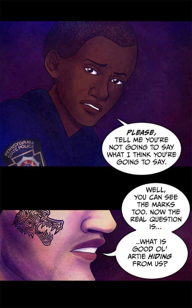
An attempt at vertical format for Webtoon is being made 😀
The good so far: bigger panels + text, updates seem longer, I can have a black background which always makes things look immensely better (I haven’t used it for my regular print format because I don’t think it’d be very feasible if I were to actually print it, but the vertical format is web-only anyway, soooo…who cares :D)
The bad so far: bigger panels, which means that each and every one of my mistakes is 10 times more glaring than before D: also, having to redo the lettering all over again is a pain in the butt, just as I thought. I swear I can recite the first few chapters of The Emergency Coven by heart by now, given how many times I redid the lettering for this damn thing :’D
Also, on a somewhat unrelated note: I only just realized now that Adobe Fonts is a thing that exists and that I have access to. Needless to say, I already downloaded a ton of new fonts for comics, including the one you can see above. I think I’m in love *O* too bad that I can only use the fonts I downloaded in Photoshop and not in Clip Studio Paint (where I usually do most of my comic lettering), but still… I’m so happy, omg *O*
Edit: attempt completed, you can now find the comic in vertical format on Webtoon!